Role
This project took place between July, 2015 and January, 2016. I worked on this project as an interaction designer / frontend developer for my client, Meditech Solution, a startup based in Bangkok, Thailand, building a communication aid system for people with stroke and amyotrophic lateral sclerosis (ALS).
I worked alongside the Meditech research team, web developer, Lek, and the product manager, Jack. I was responsible for making eye tracking works for their communication aid platform, Senze.
Challenge
Meditech Solution was building the next iteration of Senze, a communication aid software for people with stroke and Amyotrophic Lateral Sclerosis (ALS). Senze's last iteration consists of a touch screen with buttons for users to communicate their needs such as food, medication, and the need for caretaker. It also incorporated an obsolete blink detector that could only detect blinking but not eye movement. The software had to switch the focus between each element to wait for the user to click. The users have to wait until the desired element is focused and blink their eyes. This takes a long time and put a limit on the number of elements that can be on the screen. Meditech wanted to integrate modern eye tracking technology to allows users to move the cursor freely on the screen. That's when my task came in. For Meditech, I need to design and build a desktop app that integrates an eye tracking device with the existing system. By the time I joined, Meditech had already got the design goals for the phase:
Design Goals
- Enabling the users to use their eyes to control the cursor on the screen
- Enabling the users to use common websites in their everyday life
- Be able to integrate with the existing Senze Caretaker Web Application
- Provide messaging capability for the users to chat remotely with the caretaker
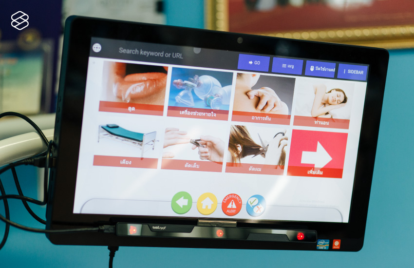
on an All-in-one DELL PC with Tobii EyeX eye tracker attached.
Source: The Standard
Process
As the concept of eye tracking-enabled user interface was quite new, I proposed to go straight to functional prototyping. Wireframes and mockups are not going to be very useful as it is not testable for our users. The amount of time testing with real users is also very limited due to their consent and exhaustion (Using eye tracking devices can cause quite a fatigue).
Making Things Click: Basic Gaze Interaction
Clicking is the most basic way users interact with graphical user interfaces. But, enabling clicking with an eye tracker can be tricky. Plugging an eye tracker in an getting on-screen gaze coordinates was just a small baby step. We also had to dealt with jittering, configuration sensitivity, and user's fatigue. After some experiments, I came up with a first functional prototype. It was a Chrome Extension that only test two things: blink clicking and delay clicking.
Blink Clicking
Triggering the click by blinking your eye once. Although how intuitive it sounds, blink clicking was proven to be impractical. From our internal testing, no matter how trained the user is, blinking not only causes your eyes to roll and miss the desired click target and also causes the users to momentarily lost their visibility.
Delay Clicking
Delay clicking refers to a click mechanism in which the user has to steadily focus on an element for a period of time. This paradigm is borrowed over from gesture-based interfaces where clicking is also a challenge. Many Kinect games use delay clicking as the main clicking mechanism instead of push clicking to avoid ambiguity.
From our initial testing, delay clicking increases the success rate of a click and left us a lot of room for tuning such as delay time and cool down time.
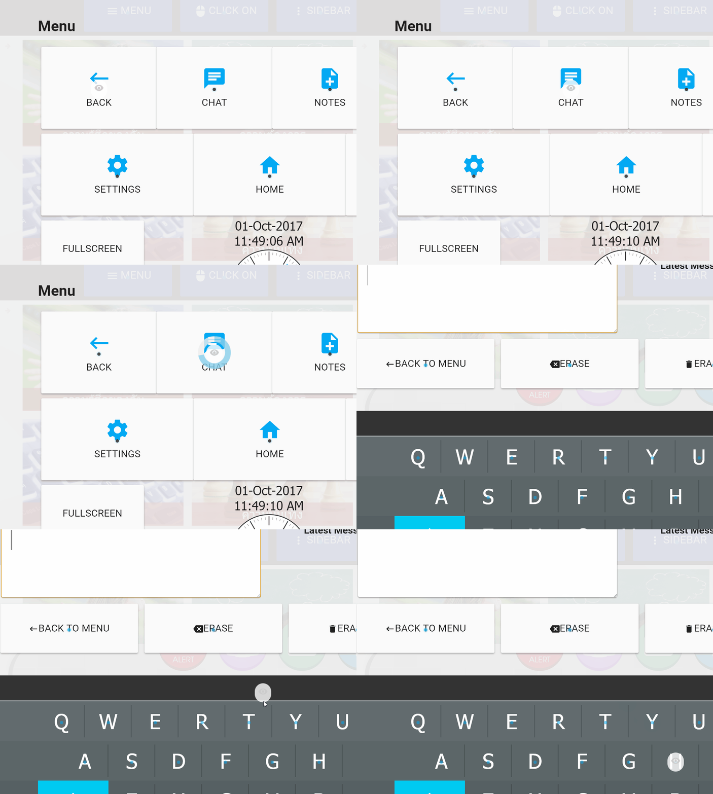
I also implemented scrolling which is essential to consume modern web content. I introduced scrolling with hover buttons and scroll zones. From the sidebar, users can hover the cursor on scroll up or scroll down button to initiate scrolling. Users can also hover the cursor on 'scrolling zones' which are designated areas on the top and the bottom of the page.

Gaze Clicking
Trigger a click by focusing on any elements for 2 seconds
Gaze Snapping
Snap the cursor to the element to accommodate clicking
Gaze Scrolling
Allow scrolling at lower, upper areas of each scrollable elementsThe user just need to hold a cursor on the desired element for 2 seconds to click.
The web is made for Hands: Rethinking gaze-friendly UI
In the second prototype, I focused on testing how could users interact with the web. I switched from a Chrome Extension to a Chrome App and experimented on making the eye cursor work with different websites.
Turns out the eye cursor alone is difficult to use with most websites because most of the web is created for hands. Elements are only big enough to be clickable but still too small to handle the jittering of the eye cursor. For that, I introduced Web Snapping mechanism where the cursor will be snapped to the button at a close enough distance. To detect a clickable element in the web page, I implemented a page traversal mechanism that could check if the cursor lies in elements worth snapping (buttons, textboxes, checkboxes and etc.)
Also, I found that several mobile sites are already more gaze-friendly than its desktop counterpart. So we chose to link to the mobile version of each website in our quick bookmarks menu later on.
The Eyes Speak a Thousand Words: Typing with your eyes
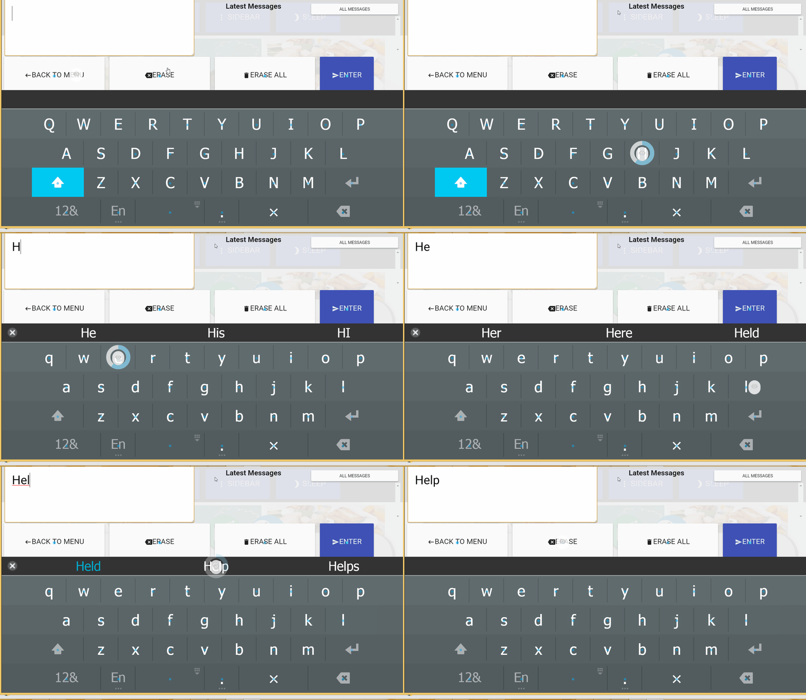
Typing is another challenging task to accomplish with an eye tracker. It is not enough to just provide an onscreen keyboard with auto-snapping. I developed an auto-suggestion where a word is suggested according to user's partial input. The system also allows adding of custom words from Senze's administration backend.
User Testing
Meditech research team tested the products at Hospitals and user's home. We've collected quite a lot of valuable feedbacks.
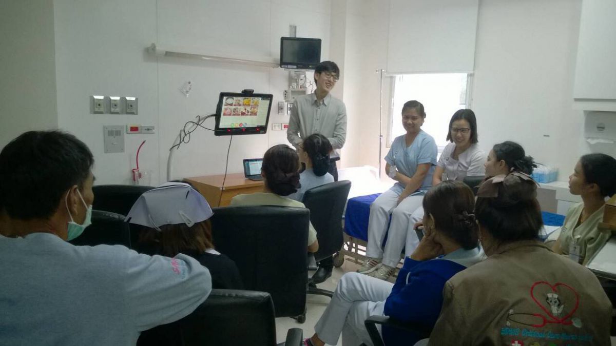
A session of user testing at Bangkok Pattaya Hospital
conducted by Meditech's research team.
From the tests, some issues are revealed:
Fatigue
Using the system for a continuous period of time can cause fatigue.Buttons are too small
Even though we've intentionally make buttons big, it can still be too small for eye trackers.Difficulty in typing
The on-screen keyboard put in the last iteration was not enough for the user.Incompatibility with several websites
Our HTML parsing and modifications still does not work with some websites
The feedback was very valuable for the latter phase of the projects
Final Iteration
We addressed insights from our testing. The improvement in the final iteration in this phase includes:
Sleep mode to prevent fatigue
Although user can turn eye clicking on and off, that might not be enough to rest the user's eye. We decided to add a sleep mode to also reduce unwanted brightness that might irritates the user.Improved Typing Suggestions
The initial keyboard suggestion was built with to work too much like a smartphone keyboard. I fine tune it to suggest the words that better align with the context of caretaker system.Rearranged Button Layout
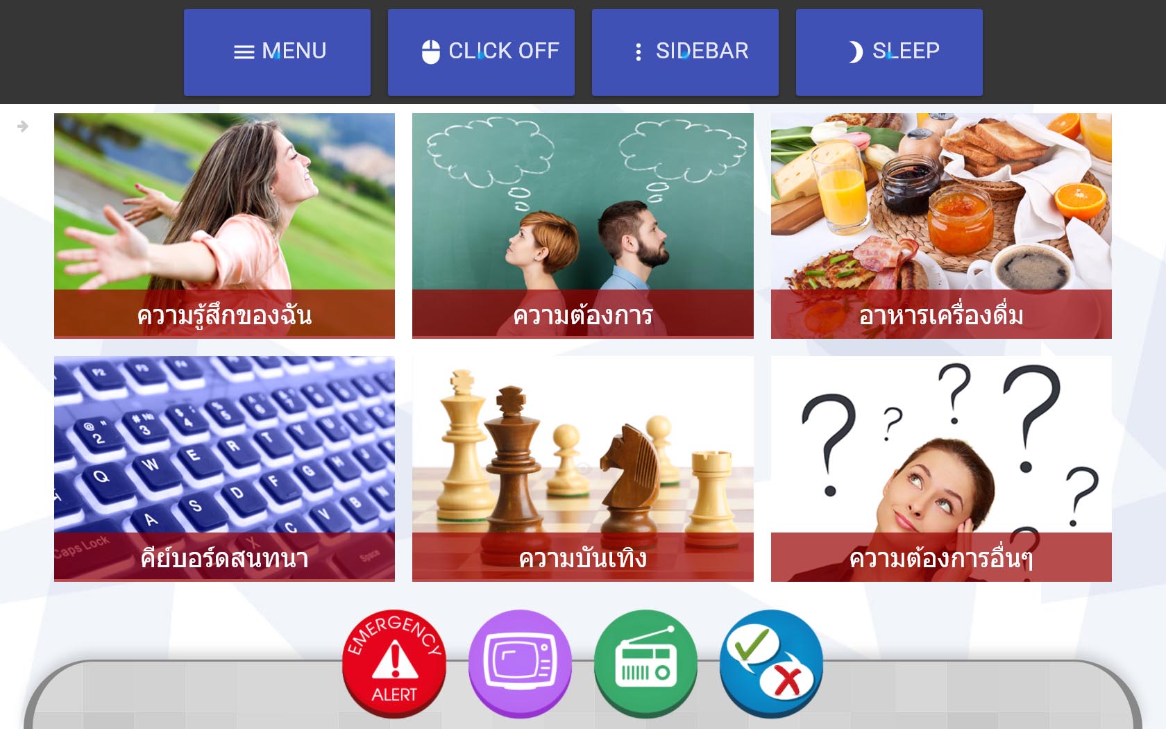
We learned that the eye cursor will become less accurate and hard to use near the vertical edges of the screen. Therefore, I moved the main buttons to a more clickable area by sacrificing the address bar which we've learned from the tests to be not as useful as we might have thought.The home screen before revision (left) and after revision (right)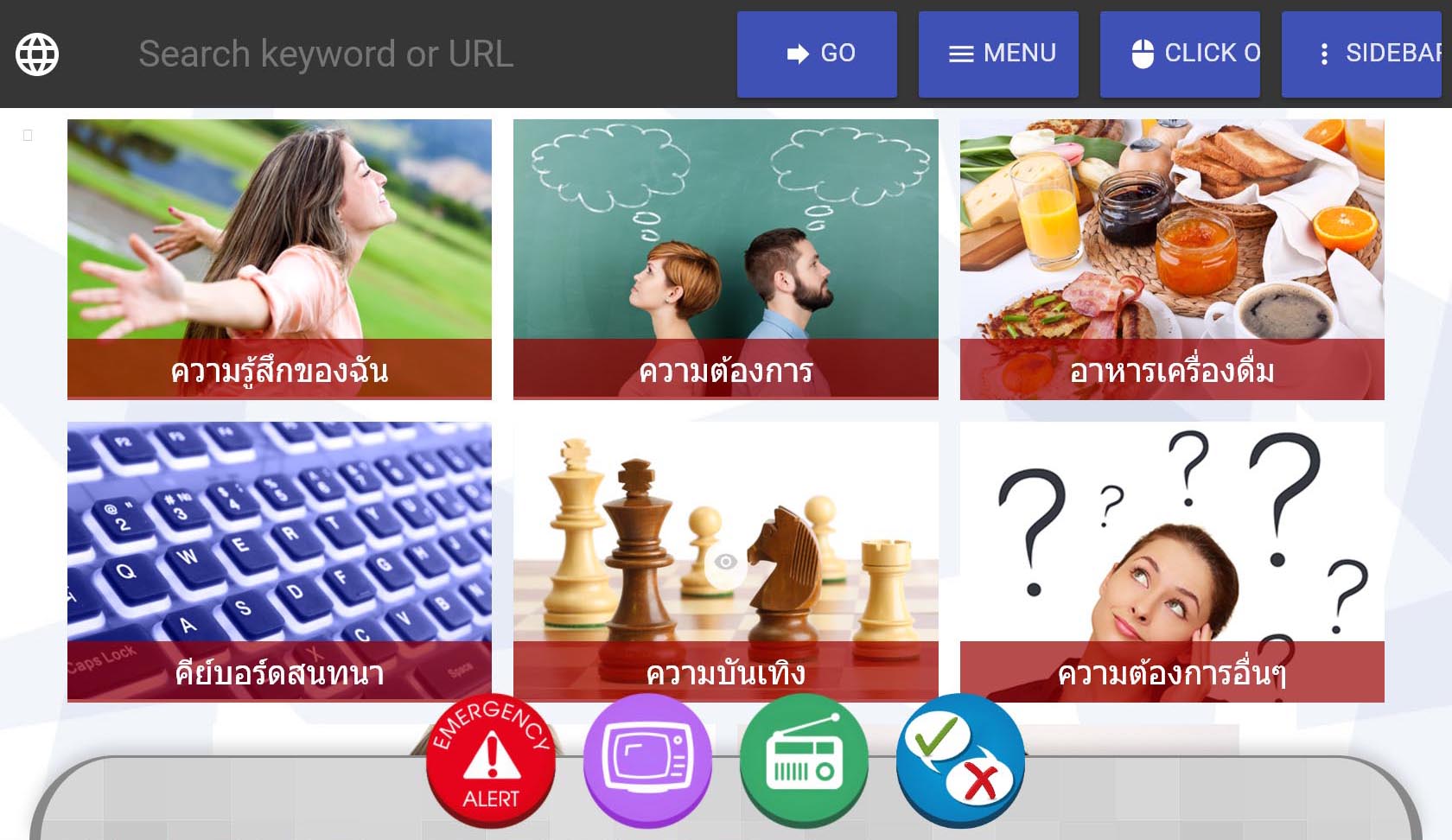
Deeper compatibility with Facebook, Google, YouTube
All of our web compatibility feature would be useless if it does not work with the sites the users use everyday. That's why we focused on making certain sites very usable. I have also considered building apps that connect to the sites API, but the limited API access can be troublesome. For example, as of now, you cannot access user's news feed via Facebook API. Therefore, I developed custom CSS modification processes for sites such as Facebook, Google and YouTube.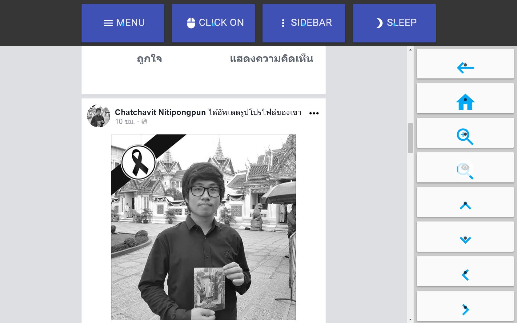
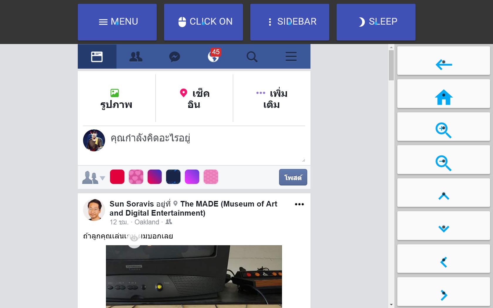
Final Snapshots

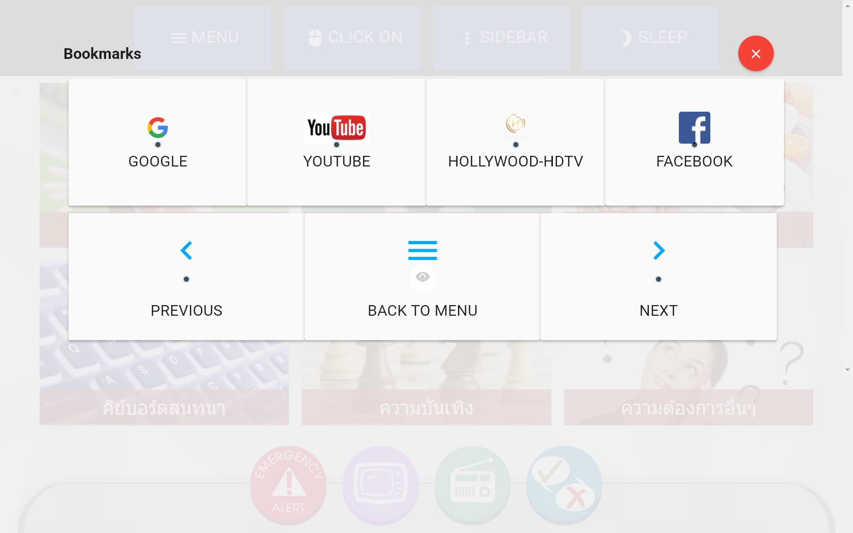
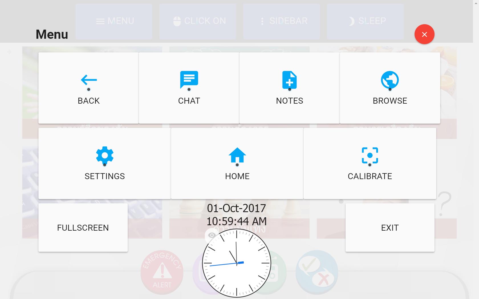
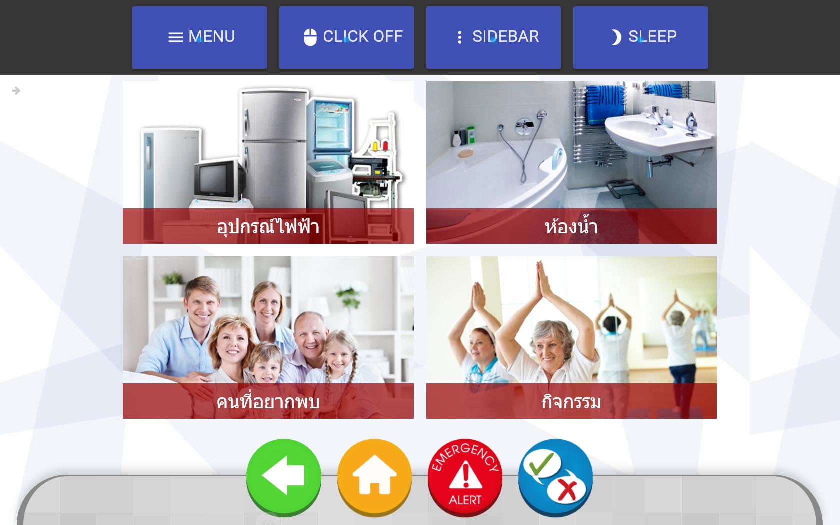
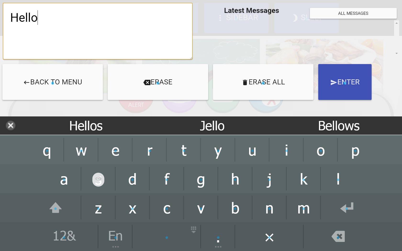
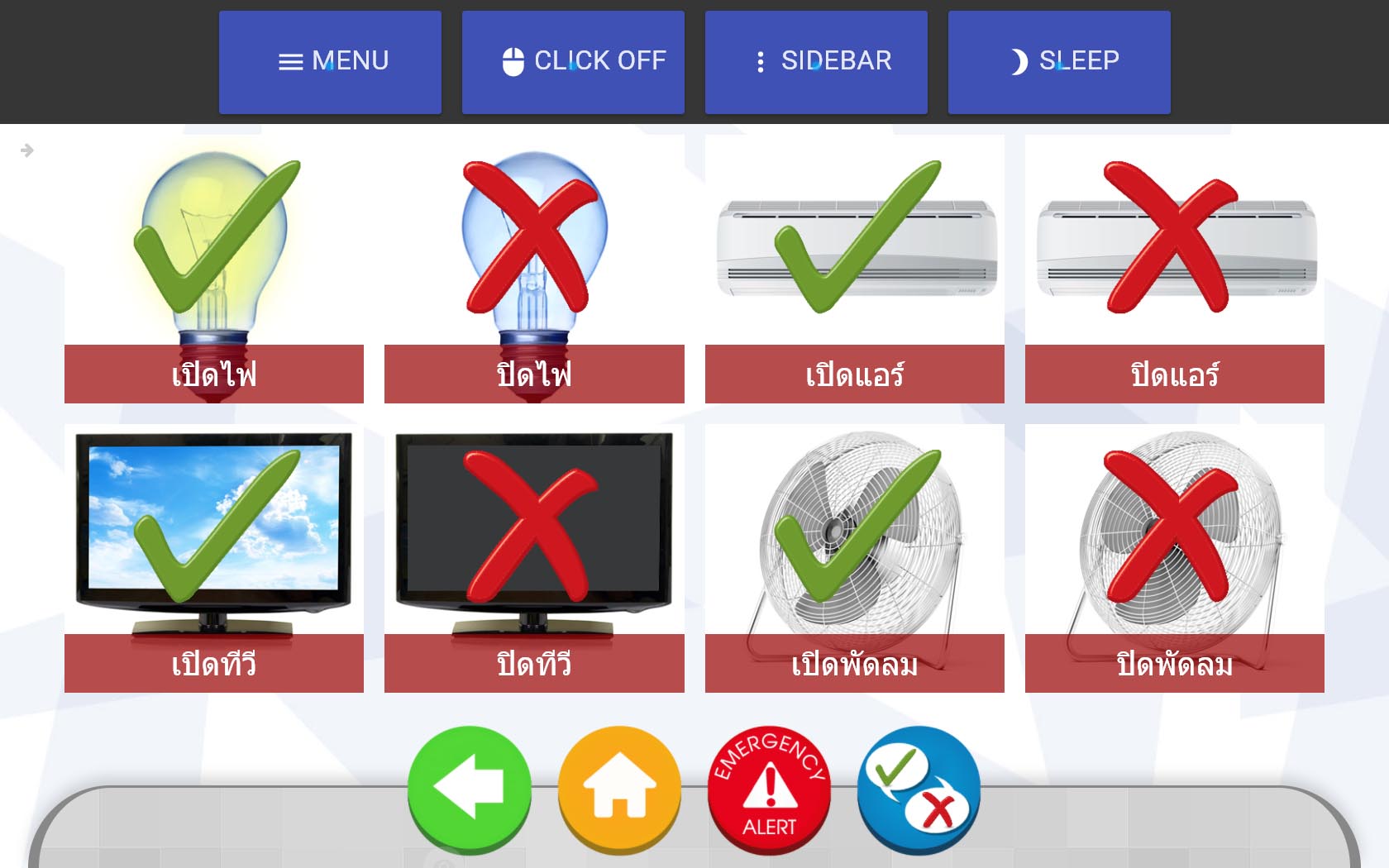
Outcome
The Chrome App I designed and developed was released as a part of Senze 4.0. It helped Meditech to raise another round of funding from Invent ventures and won a pitch competition at Startup Thailand Conference in April 2016. As of late 2016, ten public hospitals in Thailand has adopted Senze. Also, because of Senze, one of our users was able to continue writing her novel despite the developing ALS condition.
A video produced by Meditech Solution demonstrating the latest version of SenzE
Key Learnings
Empathy is useful for developers
Working with eye tracking devices, I can feel the fatigue created by the device. This drove the design decisions down to the coding of each element.
Functional prototypes can be very useful early in the project
Designers seems to fear skipping the wireframing and mockup phase to avoid design fixation. But, I learned that it might be productive to bring the functional prototype early on when the interaction concepts is hard to communicate in other medium. Also, functional prototypes are getting a lot easier to build with the technology we have today.
Web accessibility is super challenging
We are quite a long way from making the web accessible to everyone. In this project, I have got a chance to dig into ARIA (Accessible Rich Internet Applications) tag specifications and some web accessibility standards. The experience was very enlightening and provoked me to see the web in a different way.
Contributors
- Meditech Development Team (MySenze Web Application)
- Meditech Senze Sales Team
- Seksun Sukjareon, Product Manager, Meditech
- Soravis Prakkamakul (UX Designer, Chrome App Developer)